Technical analysis is a must-have skill for any self-respecting day trader. However, it is also an incredibly useful tool for long- and medium-term investors too. Following last week's look at the RSI and MACD oscillators, let's dive straight into some more technical analysis.
This time around, we'll be building on the trend oscillators studied a week ago with a close look at perhaps the most useful and versatile volatility indicator in existence: Bollinger Bands. Some of you may have never heard of them, but don't worry: by the end of this article, you'll know everything there is to know about these important indicators!
Bollinger Bands
Bollinger Bands were developed by renowned technical trader John Bollinger and consist of a pair of trendlines that are plotted two standard deviations (positively and negatively) away from the simple moving average (SMA) of a given security's price. Their purpose is to provide investors with a higher probability of properly identifying overbought or oversold conditions. This makes them a perfect confirmation tool to complement an analysis of the RSI or MACD.
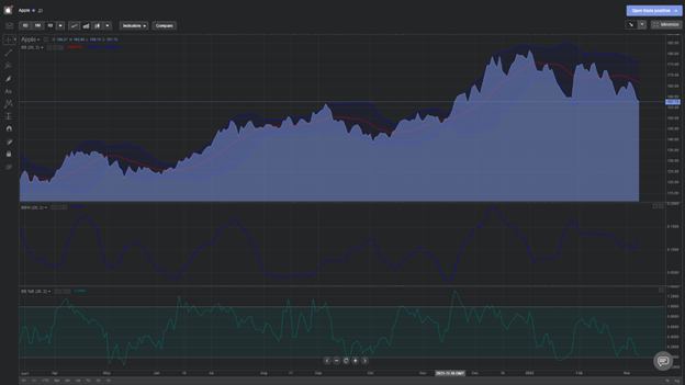
The formula for calculating them is pretty complex, but luckily for us, the Libertex platform can calculate and automatically apply the bands, as well as additional oscillators expressing the width and percentage disparity between the upper and lower bands. Here's what the one-year Apple (AAPL) chart looks like with all three overlaid:
But how do they help us trade?
The established doctrine among traders is that the closer prices move to the upper band, the more overbought the market is. Conversely, prices moving towards the lower band signal oversold conditions. Beyond this, a widening of bands signals increased volatility, while a contraction is a sign of lower volatility. This is because standard deviation is itself a measure of volatility.
The major leading signal with Bollinger Bands is a phenomenon known as "The Squeeze". This is when the bands come closer together, which indicates decreasing volatility and the existence of potential opportunities for opening trades. On the other hand, a widening of the bands is seen as a sign of increasing volatility and — depending on what the RSI is indicating — is often interpreted as a signal to close out positions or reassess take-profit levels.
Let's take a look at the AAPL chart once more:

See the green circles? These indicate a sudden tightening of the bands. A short time after this, we see significant swings to the upside, which would indicate that the squeeze represents an optimum entry point for a long position.
What about when to sell?
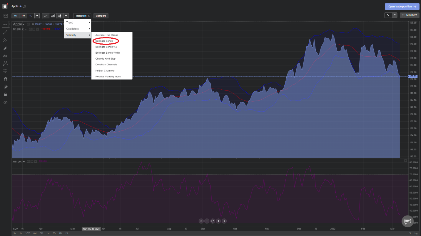
This is a little trickier and requires a combination of indicators for any degree of certainty as to when a decline is imminent. Indeed, even John Bollinger himself states that his bands are not intended to be used as a standalone leading indicator and must be combined with several other technical analysis tools to provide reliable, actionable signals. Nonetheless, we will attempt to show their utility even when combined with just the RSI we looked at last week. Luckily, the Libertex in-app technical analysis suite makes this a breeze.
Simply go into full-screen mode on the chart and follow the instructions from last week to add the RSI (click on the indicators tab, hover over 'Oscillators' and select the RSI). Then, do the same again and add the Bollinger Bands as shown below:
Now, as we mentioned earlier: a widening of the bands is a good sign that market volatility is increasing and a fall could be on the cards. The problem is that these widenings are generally much more protracted and less clearly defined compared to the contractions. This means that we can potentially miss out on a lot of upside movement if we close out positions at the first sign of widening, as shown by the yellow circles below:
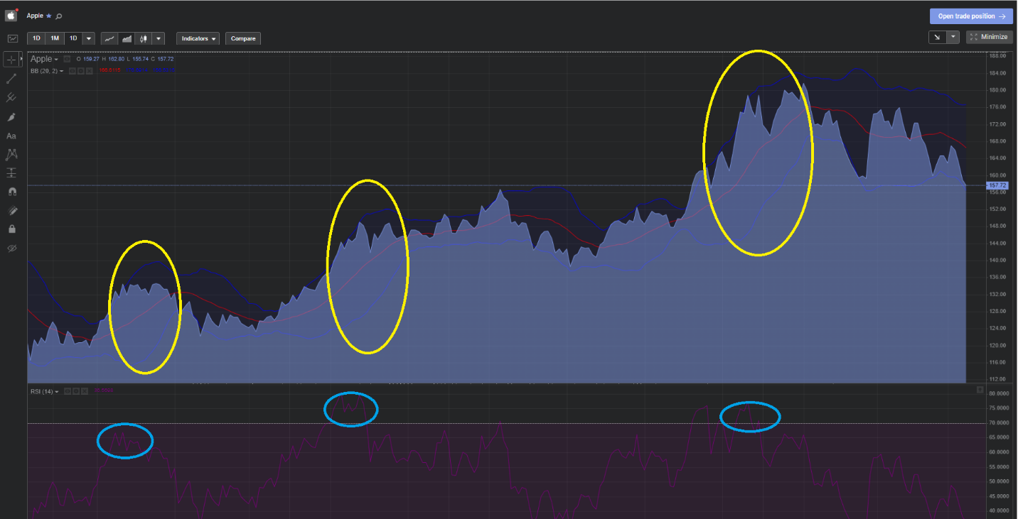
Notice how long the periods of widening (volatility) are? This is because the rising prices associated with the uptrend itself represent significant volatility compared to the trailing 20-day SMA, so it's hard to determine at what point the width represents a truly overbought market.
However, if we incorporate the RSI (peaks circled in blue) into our analysis, we see that these are much more precise as a leading indicator. By combining the two together (peak of the RSI and pronounced widening of Bollinger bands), we can predict future price declines much more accurately. This is why Bollinger himself recommends joint analysis using non-correlated tools such as the RSI and MACD.
Expand your knowledge with Libertex
Hopefully, you enjoyed this latest instalment in our technical analysis trading series. Given the interoperability of Bollinger's eponymous indicator with the key trend oscillators we looked at last week, you should now be able to refine your technical analysis skills further and generate even more accurate trading signals at home. If you're feeling confident in your abilities after these two tutorials, you could consider trying them out on a live position. For the more risk-averse, this week could be another great opportunity to test them out in your Demo account.